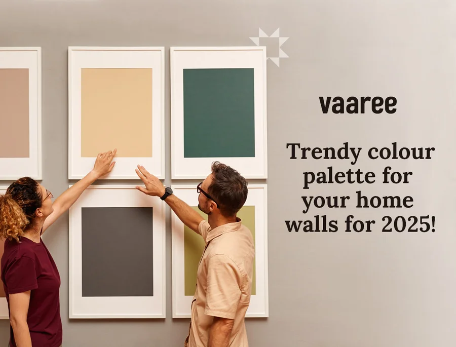
When we think of refurbishing our house or entering a new one, there are several elements to consider: curtains, flooring, wardrobes, kitchen slabs and more. Amongst these, wall colour is particularly important. It shapes how light is perceived in a room and provides a reference point for the rest of the interior scheme.
The hues of your walls can help guide choices for curtains, rugs, lighting, accent furniture and wall decor. Let the colour palette of your walls set the direction for the room.
Top 11 Popular Wall Colours Of 2025
If you are planning a fresh coat of paint, here are 11 style-led wall-colour directions for 2025. From soft pastels to deeper hues, each offers a distinct starting point for a considered interior.
1. Neutral Tones
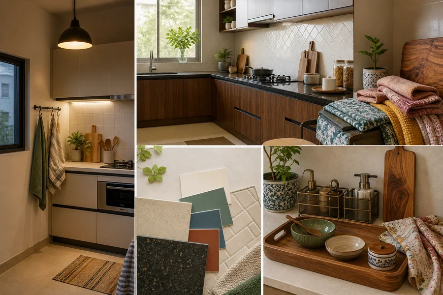
Neutral walls remain a versatile choice. Ivory white, off-white, cream, white dove, light beige and grey create a flexible base for many interior styles. Pair them with colourful wall art, wall accents, cushion covers, sofa covers and wooden furniture to introduce contrast and character. A neutral backdrop can make it easier to update a room over time through textiles and smaller decor pieces.


2. Earthy Shades
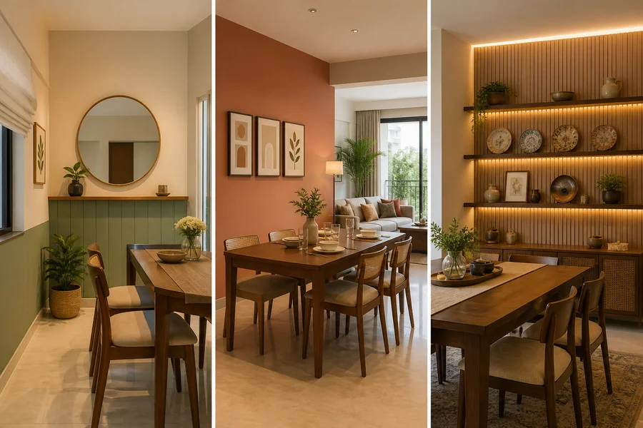
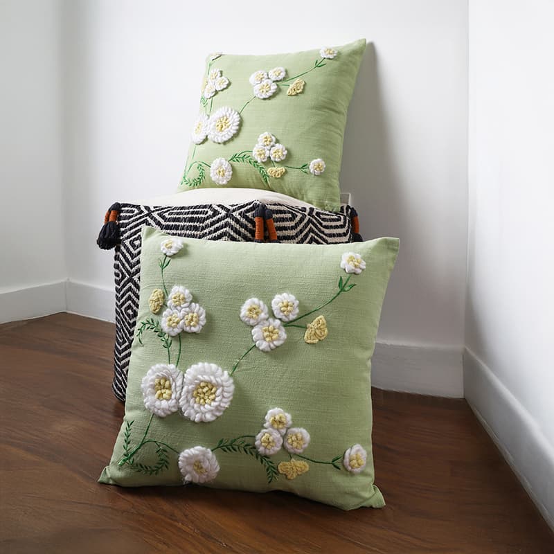
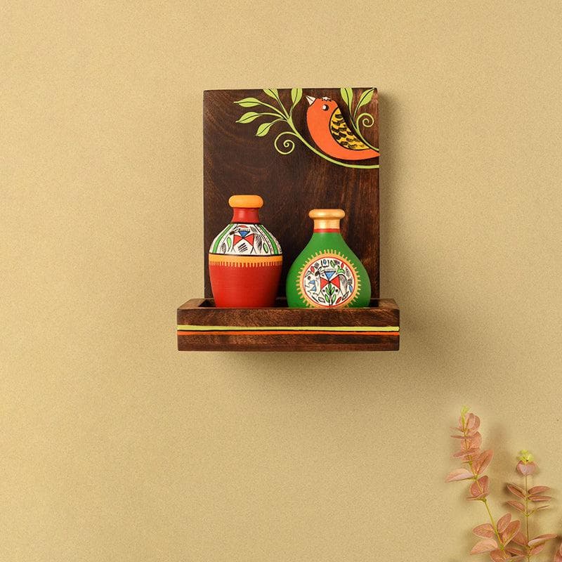
Earthy shades such as terracotta, tan, caramel, burlywood and burnt sienna bring a grounded, warm direction to a room. They can work well with light or darker decor, local folk art and clay accents. Consider olive-green cushions against burnt sienna walls, or plants in macramé holders arranged on floating shelves. Test paint swatches in the room at different times of day before committing to a shade.

3. Aqua Blue
Aqua blue, beach blue, baby blue, ice blue and sky blue can create a light, airy visual direction. Pair an aqua wall with white curtains, deep-blue sofa covers and brown wooden furniture, then balance the scheme with touches of white, grey, yellow or brown. Keep the undertone of the paint in mind so that it sits comfortably with existing furnishings.
4. Deep Blue
Deep blue offers a more dramatic counterpart to aqua. Cobalt, indigo, Prussian blue, midnight blue, navy and Egyptian blue can be considered for formal areas such as a dining space or living room, particularly as a focal wall. Copper, brass and wooden accents can add contrast against deeper blue walls.



5. The Versatile Teal
Teal can sit between blue and green, making it a flexible option for revamping a room. Teal blue and teal green work with shimmering white curtains, beige seating and rustic wooden tables. Gold, beige, white and black accents can each create a different interpretation of the same wall colour. Sample the paint beside your curtains and upholstery to see how the combination reads together.
6. Rainforest Green
Rainforest or forest green can give a room a nature-inspired visual direction. Consider pairing it with wine-red cushion covers, a floor lamp or a dark side table. Neutral and earthy tones such as beige, off-white, mustard and light pink can balance the depth of green.
7. Ballerina Pink
Ballerina pink is a soft pink hue that coordinates with teal blue, gold, beige, white, burgundy and olive green. Related shades may include coral pink, delicate pink, blush pink and flamingo pink. Use it across a wall, on a smaller accent area, or alongside neutral furnishings depending on the amount of colour you want in the room.
8. Rich Purple
For a more saturated palette, consider rich purple, mulberry or deep magenta. Purple walls can be balanced with beige curtains, a wooden centre table, a mustard rug and a copper vase. Lilac and plum variations offer different depths within the same colour family; compare samples against the room’s natural and artificial light before choosing.
9. Sunshine Yellow
Sunshine yellow can introduce a bright visual focal point. Pair it with sheer white or light-blue curtains, or explore softer yellow-adjacent shades such as sandcastle and biscotti. French navy doors or cream decor can provide contrast while keeping the palette cohesive.
10. Golden Orange
Golden orange, honey, tangerine and ochre are warm options for a more expressive room. Complement orange walls with olive-green curtains, a grey sofa, white cushions, a beige rug and wooden flooring. Introduce these shades gradually with a test area if you are unsure about using them across every wall.
11. Firebrick Red
Firebrick red can make a bold statement when paired with grey, white, black and beige. Bring these balancing shades in through furniture, coffee tables, rugs, curtains, wall decor and linen. A red accent wall may be a useful approach when you want to retain a lighter overall scheme.


To Summarise
Each of these colour schemes offers a different direction for your walls. From sunshine yellow to aqua blue and golden orange, choose a hue that works with your room’s light, existing finishes and the atmosphere you want to create. Paint samples are especially useful for checking how a colour changes from day to evening.
Related reading
Keep exploring