Quick Answer
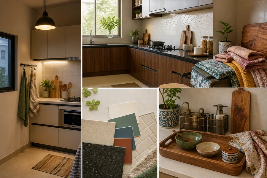
Choose kitchen colours by assessing cabinets, worktops and backsplash first, then considering the room’s light, visual clutter and cleaning routine. A useful starting point is one dominant base, one supporting shade and one controlled accent. Test removable accents beside fixed finishes before committing to larger changes.
Definitions
Fixed elements
The parts of a kitchen that are difficult or expensive to change, especially cabinets, worktops and backsplashes.
Dominant colour
The main background or visually largest colour in the kitchen palette.
Supporting colour
A secondary shade that connects the dominant colour to existing finishes and adds variation without competing with them.
Accent colour
A smaller, deliberate colour note used on accessories, textiles, lighting or a limited feature area.
Undertone
The subtle warm, cool or neutral cast within a colour that affects how it relates to nearby finishes and lighting.
Three-colour rule
A practical organising principle that limits a palette to one dominant colour, one supporting colour and one accent.
Kitchen Colours: Start With the Decision, Not the Shade
There is no single best kitchen colour. The most practical palette works with the cabinets, worktops and backsplash you already have, while fitting the kitchen’s light and the way your household cooks and cleans.
Start with what cannot easily change, then assess daylight, artificial light and how visually busy the room feels. Compact kitchens often benefit from fewer abrupt colour changes and less counter clutter, but no shade alone can guarantee a larger-looking room. Once the base is clear, use accessories to introduce contrast gradually.
- Begin with fixed finishes rather than a trend-led paint name.
- Check the room in its everyday daylight and artificial lighting.
- Consider where splashes, steam and frequent wiping occur.
- Use movable accents to test colour before changing a broad surface.
Start With Cabinets, Worktops and Backsplash
Treat cabinets, worktops and backsplash as the starting palette. Identify the finish that occupies the most visual space, then note whether it reads warm, cool, dark, light, patterned or strongly grained. A cream cabinet can have a warm yellow undertone, for example, while a pale grey countertop may lean blue or beige.
Coordinate with undertones rather than trying to match every surface exactly. If a patterned backsplash or veined countertop already attracts attention, quieter surrounding colours usually give it room to breathe. When fixed finishes are simple, a supporting shade can bring more personality without making the room feel crowded.
- What must stay in the kitchen?
- Which existing finish attracts attention first?
- Which colour family appears in more than one fixed element?
- Would a new colour complement the undertone rather than compete with it?
Choose Colours for Compact, Low-Light and Well-Lit Kitchens
In a compact kitchen, use a restrained base and avoid creating high contrast across every small surface. Repeating one or two related tones and keeping daily items organised can make the whole scheme feel more composed. Dark colours can still work, especially on a limited accessory or defined zone, but their effect depends on how much surface they cover and what surrounds them.
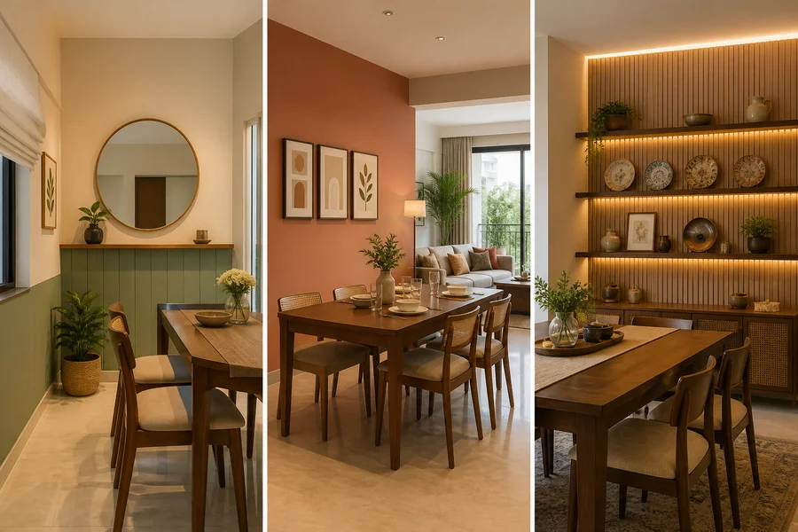
For low-light kitchens, compare samples under the bulbs you actually use. Artificial light can make a soft neutral appear warmer, cooler or more saturated than expected. In well-lit rooms, daylight often reveals undertones more clearly and can make bright shades feel stronger over the day. If the kitchen opens into a dining or living area, carry at least one compatible tone between the spaces for a more connected result.
Lighting deserves the same attention as colour: the finish of a fixture affects the look of the room, while the quality and direction of its light affect how the palette appears.
- Compact: limit abrupt contrast and reduce visible counter clutter.
- Low-light: inspect colours under evening lighting, not only daytime light.
- Well-lit: check samples at several times, including the brightest part of the day.
- Open-plan: echo a nearby room’s undertone or accent for continuity.
Modern Hanging Lights

₹3,499
₹4,999
30%OFF

₹3,464
₹5,999
42%OFF

₹1,234
₹5,000
75%OFF

₹1,187
₹4,000
70%OFF

₹1,234
₹5,000
75%OFF

₹1,234
₹5,000
75%OFF

₹1,329
₹5,200
74%OFF

₹6,184
₹13,282
53%OFF
Coordinate Walls, Counters and Accents Without Overcrowding
Give each colour a job. Use the dominant neutral on the broadest visual field or as a calm background when cabinets, counters or backsplash are already expressive. Add a supporting colour through a repeatable detail, such as textiles or selected countertop accessories, to connect separate parts of the kitchen.
Use dark and bright tones with intention. A deep colour can anchor a small grouping, while a bright note can add energy, but either becomes more demanding when repeated across every visible surface. Wood grain, metallic finishes and patterns also add visual activity, even if they are not separate paint colours.
A simple comparison can help: choose calm and minimal for low visual contrast, warm and grounded for earthy or wood-led finishes, or colourful and expressive for a room with a quieter fixed base. Select only the amount of contrast that feels comfortable in daily use.
- Keep the largest surface visually calm when fixed finishes are busy.
- Repeat a supporting colour in a few small places rather than everywhere.
- Use dark shades sparingly when cabinets or worktops already carry visual weight.
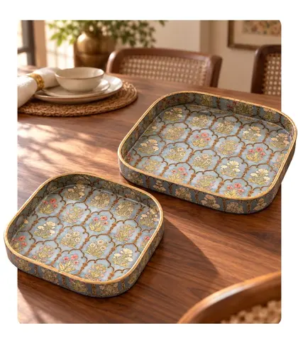
- Let a patterned tray or similar movable object provide a controlled decorative note.
 FastDelivery
₹409
₹999
59%OFF
Balance Preference With Indian Cooking and Cleaning Needs
Kitchen colour choices should suit the reality of daily cooking. Near the hob and prep zone, consider turmeric, chilli, oil splashes, steam, dust and frequent wiping before choosing a very pale, highly saturated or delicate-looking accent. This is not a reason to avoid favourite colours; it is a reason to place them where their upkeep feels manageable.
Washable textiles and easy-to-move accessories are practical ways to add colour around active cooking areas. A subtly varied or mid-tone item may make everyday marks less immediately noticeable than a perfectly uniform pale one, but maintenance still depends on its material, placement, use and care instructions.
Keeping frequently used items contained can also reduce visual noise on the counter, allowing the chosen palette to read more clearly. Choose organisers for their practical use first, then treat their finish as part of the overall colour scheme.
- Reserve delicate-looking accents for lower-splash areas.
- Choose items that can be cleaned according to their care instructions.
- Separate colour preference from maintenance tolerance.
- Use practical counter organisation to support a calmer compact kitchen.
 FastDelivery
₹367
₹1,199
69%OFF
Use the Three-Colour Rule and Test Samples Before Committing
The three-colour rule is a simplifying guideline, not a strict design law. Start by counting the existing cabinet, countertop and backsplash colours as part of the palette. Then identify a dominant colour for the main visual background, a supporting colour that relates to fixed undertones, and an accent colour for a smaller, deliberate highlight.
Test colours beside the actual finishes, not only on a phone screen or in isolation. Move a sample near the backsplash, beneath upper cabinets and against the worktop. View it in daylight and under artificial light at the time the kitchen is used most. This reveals shifts caused by bulb warmth, shadows and reflective surfaces.
Before choosing a larger or more permanent field of colour, live with removable pieces for several days. Check whether the combination still feels balanced when towels are in use, dishes are on the counter and the kitchen is being used normally.
- Dominant: the main background or broadest colour field.
- Supporting: a connecting shade that echoes the fixed finishes.
- Accent: a smaller colour note with easy replacement potential.
- Test in more than one part of the kitchen and at more than one time of day.

₹304
₹349
13%OFF

₹304
₹349
13%OFF
Kitchen Towels
₹304
₹349
13%OFF
₹304
₹349
13%OFF

₹304
₹349
13%OFF

₹304
₹349
13%OFF
₹549
₹899
39%OFF

₹549
₹899
39%OFF

₹304
₹349
13%OFF

₹304
₹349
13%OFF
Add Colour Without Permanent Changes
Renters can build a considered kitchen palette without altering walls, cabinetry or counters. Begin with the existing base, especially if it is already patterned or strongly coloured, and add a cool, warm, muted or bright accent through pieces that can be changed easily.
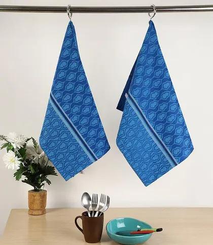
Kitchen towels offer an immediate colour test near the work zone. Serving trays, baskets and countertop organisers can introduce another controlled note while helping daily items look more contained. In an open or low-light kitchen, review both how a lighting fixture looks and how its light changes the colours around it.
Keep the counter relatively calm in a compact kitchen. A few useful, coordinated objects tend to have more impact than many unrelated decorative items, and they make it easier to update the palette when your preferences change.
- Use textiles for the easiest low-commitment colour experiment.
- Add colour in contained areas with trays or storage pieces.
- Rotate small accents instead of changing permanent surfaces.
- Choose practical pieces that support an orderly counter as well as the palette.
Serving Trays
FastDelivery₹409
₹999
59%OFF

₹1,272
₹2,599
51%OFF
 FastDelivery
₹599
₹1,299
54%OFF
 FastDelivery
₹760
₹1,399
46%OFF

₹1,942
₹3,999
51%OFF

₹3,289
₹4,299
23%OFF
₹637
₹1,499
58%OFF

₹2,834
₹3,499
19%OFF
A Final Kitchen Colour Checklist
Use this check before purchasing accessories, choosing a wall colour or making any other long-lasting change. It keeps the decision grounded in your room rather than a colour trend viewed out of context.
- Have I identified the fixed finishes and their undertones?
- Is the kitchen compact, low-light, well-lit or open to another room?
- Which colour is dominant, which is supporting and which is the accent?
- Where will oil, cooking stains and frequent wiping be most visible?
- Have I limited dark or bright colour to areas the room can visually support?
- Have I tested the palette beside fixed finishes in daylight and artificial light?
- Can I create the same effect with removable textiles, trays, organisers or lighting if I rent?
Final Verdict
- A practical kitchen palette coordinates with the finishes that are hardest to change, feels comfortable in the room’s actual light and suits the household’s cooking and cleaning routine.
- Begin with the dominant fixed finish, build around one dominant colour, one supporting colour and one accent, then test the result in the kitchen itself.
- Use washable or movable accessories to explore colour first, particularly when you rent or are unsure about a larger commitment.
FAQs
Which colour combinations make a compact kitchen feel less crowded?
A restrained base with one related supporting shade and a small accent is often easier to manage than many contrasting colours. Coordinate with existing cabinets and counters, limit visual clutter on the worktop, and avoid introducing a different strong colour on every small surface.
How should daylight and artificial lighting affect kitchen colour choices?
Always inspect samples in both. Daylight can reveal undertones and intensify bright colours, while artificial bulbs can shift a colour warmer, cooler or duller. Check the palette at the times when you use the kitchen most.
Which kitchen colours work with existing cabinets and countertops?
Choose colours that relate to the undertones of the cabinets and counters. Warm wood, cream and beige finishes often pair naturally with earthy or softened warm accents, while cooler greys and stone finishes may suit muted greens, blue-greys or clean neutrals. Patterned surfaces usually benefit from quieter companions.
Where should dark or bright colours be placed in a kitchen?
Use them on smaller, intentional areas such as towels, trays, selected accessories or a limited feature zone. This lets you add contrast without asking every surface to compete. Larger dark or bright areas can work too, but assess their surface area, the room’s light and the weight of existing finishes first.
Which kitchen colours are easiest to maintain in an Indian home?
No colour is universally easiest to maintain. Consider the item’s material, finish, location and care instructions, especially near the hob and prep areas. Mid-tones, subtle variation and washable accessories can be practical choices where oil, steam, spices and regular wiping are part of daily use.
How many colours should a kitchen palette contain?
The three-colour rule is a useful starting point: one dominant colour, one supporting colour and one accent. Count cabinets, worktops and backsplash as part of that palette, and remember that wood grain, metallics and patterns add their own visual activity.
How can renters add colour without permanent changes?
Use washable kitchen towels, serving trays, baskets and organisers to test accents against the existing finishes. These items can add warmth or contrast in controlled amounts and can be replaced when your preferences change.
How should I test kitchen colour samples before choosing?
Place samples next to the cabinets, worktop and backsplash rather than viewing them alone. Move them around the kitchen, inspect them in daylight and artificial light, and live with removable accents for several days before making a permanent decision.
Keep exploring