Quick Answer
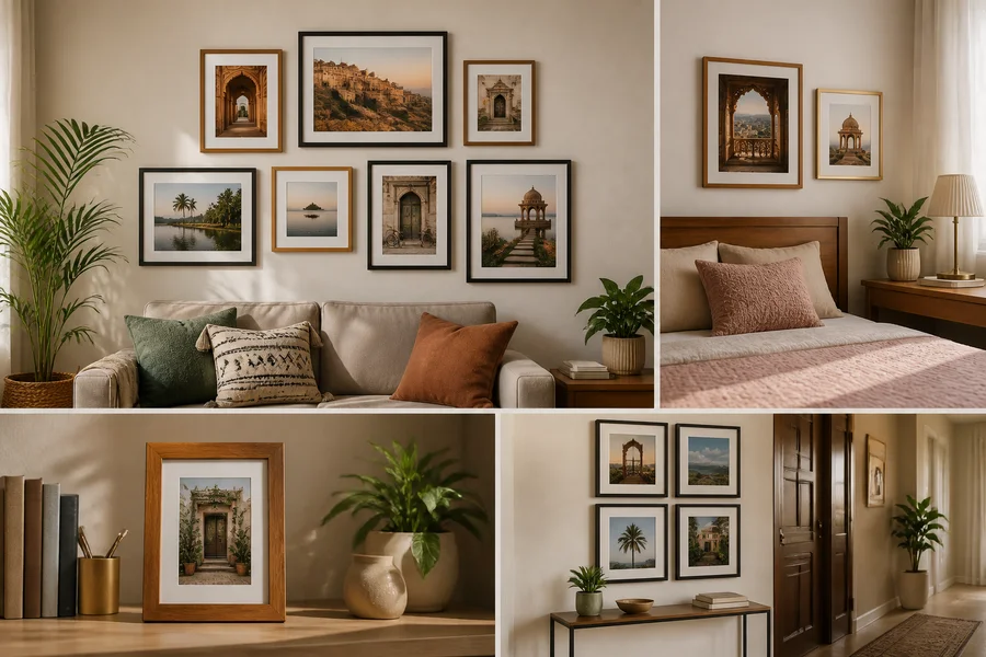
The right photo frame aesthetic starts with the room, not the frame alone. Match the display’s overall size to the wall and nearby furniture, choose finishes that support the existing decor, select a layout for the number of photographs, and place it away from harsh glare, direct sun and persistent moisture.
Definitions
Photo frame aesthetic
The combined visual effect created by a frame’s size, finish, material, layout and relationship to the room and photographs it displays.
Coordinated finishes
Frames that share a material, colour or visual characteristic, creating a calm and unified display.
Mixed finishes
Frames using more than one material, colour or texture while retaining a deliberate link such as a shared size, layout or colour palette.
Gallery wall
A planned grouping of multiple framed photographs arranged as one visual composition.
Visual centre
The approximate point around which a display is balanced; it helps determine the overall height and relationship to nearby furniture.
Photo Frame Aesthetic: Choose the Right Look for Your Room
A successful photo frame aesthetic makes the photographs feel at home in the room rather than looking like an afterthought on the wall. The best choice depends on the clear wall area, the scale of nearby furniture, the room’s existing finishes and colours, and whether you are displaying one treasured image or an entire collection.
Start with the setting before choosing a frame style. This room-first approach helps you decide on size, finish, layout, colour connection, spacing and placement. It also makes it easier to choose a practical display method for a rented home and a location with comfortable viewing conditions.
- Measure the usable wall area after allowing for doors, switches, furniture and circulation space.
- Assess the whole display, not only one frame, when deciding whether it has enough visual presence.
- Use the photographs and the room together to guide the final look.
1. Match Photo Frame Size to the Wall and Nearby Furniture
Scale is the first decision because even a beautiful frame can feel misplaced when it is too small for a wide console or too large for a narrow bedroom corner. On a compact wall section, beside a desk or above a small bedside table, begin with small or medium frames that leave breathing room around the display.
For a living-room or hallway focal wall, a larger grouping can provide the visual weight that a single small frame may lack. Judge the combined width and height of the arrangement against the sofa, console or other furniture below it. Leave visible wall around the outer edges so the display feels intentional instead of cramped.
A4 and square formats can make planning easier when they suit the photograph and the composition, but check the outer frame dimensions before buying. On a shelf, compare frame height with books, lamps and decor pieces so photographs remain visible without blocking useful light or sightlines.
- Choose compact proportions for narrow wall sections and smaller furniture zones.
- Use a repeated arrangement when a broad wall needs more presence.
- Test the visual relationship between the full display and the furniture beneath it.
 FastDelivery
₹1,282
₹2,688
52%OFF
2. Choose Coordinated or Mixed Frame Finishes
Coordinated finishes create order. They are especially useful in minimal, contemporary or formal rooms, or on walls that already have strong colour, pattern or texture. Repeating one frame colour or material lets the photographs become the main point of attention.
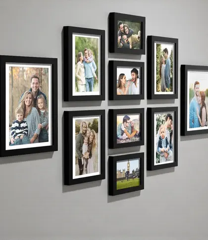
A black frame set, for example, can give a modern arrangement a crisp outline where a darker finish suits the room. Warm wood often feels softer alongside natural materials, beige tones and relaxed traditional or bohemian styling. Neither approach is automatically right; look at the finishes already present in the furniture, lighting and textiles.
Mixing wood, metal and other finishes can add character, but it needs a linking rule. Keep a shared colour family, repeated image treatment, consistent proportions or a structured layout. If every frame has a different colour, shape and material, the result can become visually busy.
- Choose one repeated finish when the room needs calm and clarity.
- Use warm wood to bring softness and natural texture to a display.
- When mixing finishes, repeat one other feature to keep the arrangement connected.
₹949
₹2,000
53%OFF
3. Select a Layout for One Photo, a Pair or a Gallery Wall
The number of photographs should shape the layout. One important image benefits from a clear position above a desk, console, bedside table or shelf, with enough quiet space around it. A larger frame can give a single photograph presence without requiring more wall decor.
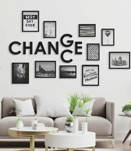
For a pair, matching frames make symmetry easy. Two related finishes in the same proportions can create a softer, less formal alternative. For a gallery wall, decide whether you prefer the discipline of a grid or a more relaxed arrangement before purchasing multiple frames. Paper templates on the wall are a simple way to assess the composition first.
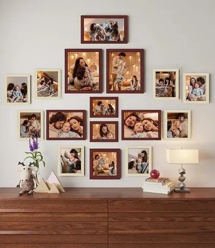
Repeat at least one element across a gallery wall: the finish, frame size, spacing, image colour treatment or overall alignment. A sixteen-frame set can suit a sizeable family-photo display in a living room or hallway, while a six-frame set is often easier to manage in a bedroom or home office. A compact four-frame grouping can work well where wall space is limited.
- Use one focal frame for a single image.
- Choose matching proportions for a balanced pair.
- Plan a grid or a relaxed composition before building a larger gallery wall.
- Lay out paper templates first to see the overall shape and visual centre.
₹1,439
₹8,000
82%OFF
Collage Photo Frame
₹949
₹2,000
53%OFF
 FastDelivery
₹1,504
₹6,000
75%OFF

₹1,799
₹3,998
55%OFF

₹499
₹2,000
75%OFF

₹1,299
₹3,289
61%OFF

₹449
₹2,000
78%OFF

₹1,549
₹3,330
53%OFF
₹1,799
₹3,998
55%OFF
4. Coordinate Photo Colours with the Room Palette
Use the room’s dominant neutrals as a foundation, then look for one colour in cushions, curtains, rugs or upholstery that can connect the photographs to the space. The connection can be subtle: a warm timber tone, a repeated dark outline or a muted shade within the images may be enough.
Black-and-white or softly toned photographs can settle a colourful room, while brighter family pictures can bring warmth and personality to a neutral setting. If your photographs vary widely in colour, there is no need to alter them to match. Instead, create cohesion through a repeated frame finish, a consistent mat colour or a clear layout.
Warm wooden frames can complement beige, earthy and natural palettes. Darker frames can add definition on lighter walls, depending on daylight and the wall’s undertone. Exact matching is not essential; a considered contrast can make a display feel more personal and lively.
- Use shared neutrals to create an easy visual bridge between photos and decor.
- Let matching frames or spacing unify photographs with varied colours.
- Choose contrast deliberately rather than trying to make every photograph blend in.

From ₹949
₹1,190
18%OFF
Wooden Photo Frame

₹349
₹999
65%OFF

₹599
₹1,299
54%OFF
 FastDelivery
₹949
₹4,500
79%OFF

₹325
₹1,099
70%OFF
₹499
₹2,000
75%OFF
₹1,299
₹3,289
61%OFF

₹449
₹1,500
70%OFF
₹449
₹2,000
78%OFF
5. Plan Spacing and Renter-Friendly Placement
Spacing makes a collection read as one display. Test positions on the floor or use paper templates and removable painter’s tape on the wall before committing. In a grid, keep the gaps visually consistent. In a looser arrangement, gaps may vary, but the outer edges and visual centre should still feel balanced.
If wall mounting is unsuitable, tabletop frames can work beautifully on consoles, shelves, desks and bedside surfaces. Keep each frame stable, away from an exposed edge and clear of areas where it may obstruct a lamp, drawer or daily task. A shelf display often benefits from varied heights, with the photo frame still easy to see.
Renters can consider freestanding arrangements, leaning frames on a secure ledge, or removable picture-hanging products. Check the frame weight, wall surface, paint finish and the manufacturer’s instructions before relying on any adhesive solution. A method appropriate for one wall or frame may not be suitable for another.
- Test placement before mounting to avoid unnecessary holes or repositioning.
- Keep grid gaps even for a more orderly look.
- Use shelf and tabletop styling where a wall display is impractical.
- Check weight and surface guidance for any removable hanging product.
 FastDelivery
₹997
₹7,700
87%OFF
Hanging Wall Frames

₹340
₹859
60%OFF

₹349
₹999
65%OFF

₹399
₹999
60%OFF

₹1,019
₹1,145
11%OFF

₹1,306
₹1,580
17%OFF

₹620
₹849
27%OFF

₹722
₹849
15%OFF

₹2,327
₹4,000
42%OFF
6. Protect Photos from Glare, Humidity and Direct Sunlight
Check the frame from the main seating or viewing position before finalising its location. Reflections from windows, spotlights and ceiling lights can obscure a photograph. Moving the display to a neighbouring wall, changing its angle where appropriate, or adjusting the nearby light source may improve viewing comfort.
Avoid locations that receive strong direct sunlight for long periods. Prolonged exposure can affect photographs and surrounding frame materials over time, so curtains or blinds may be useful in particularly sunny positions. Keep frames away from persistent steam, splashes and condensation, especially near kitchens, bathrooms or poorly ventilated zones.
In humid homes, allow some air circulation around a display and inspect it periodically for signs of moisture-related issues. Wood, MDF, iron, glass and acrylic can have different care needs, so follow any product-specific guidance supplied with the frame rather than assuming one material performs the same way in every setting.
- View the display from where it will normally be seen to identify glare.
- Choose indirect light where possible rather than prolonged direct sun.
- Avoid persistent moisture, steam and condensation around framed photographs.

₹1,359
₹2,325
42%OFF
A Quick Photo Frame Aesthetic Checklist
Use this checklist before you browse. It keeps the decision focused on the room, the photographs and the way the display will be used, rather than choosing a frame solely because it looks appealing in isolation.
- Wall: Where will the display go, and how much clear wall remains after furniture, doors and switches?
- Scale: Does the frame or total arrangement relate naturally to the width and height of nearby furniture?
- Finish: Will one repeated finish create calm, or would a controlled mix add welcome texture?
- Layout: Are you displaying one photo, a pair or a larger collection?
- Colour: Which room neutral, accent colour or material can connect the display to the decor?
- Placement: Can you test the arrangement without drilling, and is the surface suitable for the chosen method?
- Protection: Is the location away from harsh glare, direct sunlight and persistent humidity?
Final Verdict: Choose the Frame That Completes the Room
Choose a coordinated set when the room needs order, a controlled mix when it needs texture, and a larger repeated arrangement when the photograph collection is the main feature. The strongest decision comes from considering the full wall composition, furniture scale and viewing conditions rather than judging a frame on its own.
Once you know whether you need a gallery wall, a compact wall display, a tabletop arrangement or a warm wooden finish, browsing becomes simpler. Let the room set the rules, then select frames that give your photographs a comfortable, considered place within it.
Final Verdict
- Begin with the available wall and the furniture nearest to it, then choose the display’s total size.
- Use coordinated finishes for a composed look, or mix finishes only with a clear connecting element.
- Match the layout to the number of photographs and test spacing before mounting.
- Prioritise a placement with comfortable viewing, limited glare and no persistent moisture.
FAQs
How should frame size relate to the wall and nearby furniture?
Consider the full display rather than one frame alone. A compact wall or small furniture piece usually suits a smaller grouping, while a broad sofa, console or hallway wall may need a larger arrangement for visual balance. Leave clear wall around the display so it does not look crowded.
When should photo frames match, and when can finishes be mixed?
Matching frames work well when you want a calm, formal or contemporary display. Mix finishes when the room would benefit from texture or character, but retain a connecting feature such as repeated sizing, a shared colour family, consistent spacing or similar photograph treatment.
Which layouts suit a single photo, a pair or a gallery wall?
Give a single important photo a clear focal position and some surrounding empty space. A pair works well with matching proportions and symmetrical placement. For a gallery wall, choose a neat grid or a deliberately relaxed composition, then repeat at least one element across the group.
How can photo colours be coordinated with the room palette?
Use the room’s neutrals as a base and repeat an accent colour or material through the frames or nearby decor. Black-and-white images can quieten a colourful space, while brighter photographs can add warmth to a neutral room. A consistent frame finish can unify varied photographs.
What spacing creates a balanced photo frame arrangement?
A grid looks most balanced with consistent gaps between frames. A relaxed gallery can vary slightly, but its outer edges and visual centre should still feel intentional. Test the arrangement with paper templates or painter’s tape before mounting.
How can renters display photo frames without drilling?
Use stable tabletop or shelf arrangements, or lean frames on a secure ledge where appropriate. Removable hanging products may be an option when they suit the frame weight and wall surface. Always follow the product instructions and check suitability for the paint finish and room conditions.
How can glare, humidity and direct sunlight affect photo frame placement?
Glare can make photographs difficult to see from the main viewing position, while prolonged direct sun and persistent humidity are worth avoiding as placement considerations. Check reflections from windows and lights, choose indirect light where possible, and keep frames away from steam, splashes and condensation.
Keep exploring