

From ₹2,399
₹2,999
26%OFF
2 more design style

92 Products
From ₹2,399
₹2,999
26%OFF

From ₹1,699
₹2,499
26%OFF

From ₹2,399
₹2,999
26%OFF

From ₹2,399
₹2,999
20%OFF
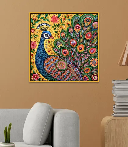
From ₹2,399
₹2,999
26%OFF

From ₹2,399
₹2,999
26%OFF

From ₹2,899
₹5,499
31%OFF

From ₹2,599
₹4,999
31%OFF

From ₹2,999
₹5,499
31%OFF
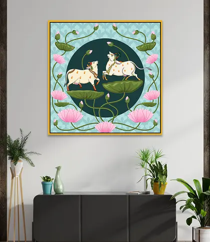
From ₹2,399
₹2,999
26%OFF
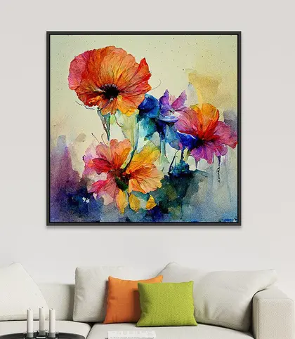
From ₹3,899
₹5,299
26%OFF
From ₹3,899
₹5,299
26%OFF
A wall can set the mood for an entire room. Decor Smart Wall Art & Paintings bring colour, imagery and a sense of intention to the spaces you see every day. Whether you want a quiet floral piece above a reading chair or a dramatic focal point behind the sofa, start with the feeling you want the room to have. Then let the artwork’s palette, proportions and finish guide your choice.
This collection is centred on canvas wall art, with designs that range from lotus blooms and scenic landscapes to devotional imagery, Indian-inspired motifs and contemporary statements. Framed pieces feature throughout, while some designs combine canvas and acrylic. If you are exploring the brand more broadly, visit Decor Smart; for a wider view of the category, browse wall art and paintings.
The most appealing artwork often does more than match the furniture: it gives the room a point of view. Think about what you would enjoy looking at over time, and how strongly you want the piece to announce itself.
Canvas is the defining material in this collection. It gives pictorial designs a cohesive surface, whether the subject is a quiet flower or a richly detailed scene. Some wall art also lists acrylic alongside canvas; check the individual piece’s materials and images to understand its particular construction rather than assuming every canvas has the same treatment. For more options centred on the medium, visit canvas paintings.
Finish is just as important to the overall impression. A matte finish tends to keep the look soft and understated, making it a natural partner for pale florals, misty landscapes and rooms with layered textures. A glossy finish gives colour and detail a more polished presence; it can suit vivid traditional artwork or a piece you want to stand out. Consider the light in your room, too: a glossy surface may catch reflections more noticeably near a bright window or lamp.
Frames help define where the image ends and the wall begins. Black can sharpen the edge of colourful or pale artwork, while gold-toned framing can pick up warmth in florals, scenic pieces and ornate designs. Look at the complete composition rather than choosing a frame colour in isolation. A frame should support the art and sit comfortably alongside nearby furniture finishes.
Before selecting a size, measure both the open wall and the furniture below it. Artwork that is too small can feel adrift above a long sofa; artwork that nearly touches surrounding shelves or doorways may feel crowded. As a starting point, aim for a piece or grouped display that occupies a substantial portion of the furniture’s width, while leaving visible breathing room at either side. Use the dimensions on the product page to check the fit rather than relying on size labels alone.
Shape offers another useful shortcut. A wide rectangular piece can anchor a sofa, console or dining sideboard. A square piece can bring balance to a narrower wall or sit neatly in a considered grouping. For a tall, slim space, look at the artwork’s orientation and the available wall height before choosing by subject alone. Some designs are single pieces, while others come as coordinated sets; confirm what is included on the product page when planning the total width and spacing. If you prefer a ready-made pairing, explore wall art sets.
You do not need to recreate every colour in a painting. Pick one or two notes to repeat elsewhere: the soft green in a lotus scene, the warm gold of a frame or the earthy red in a traditional motif. This gives the wall a connection to the room without making everything look overly matched. In a neutral living room, multicolour artwork can supply the main burst of personality. Where furnishings are already patterned or richly coloured, a quieter canvas can provide welcome balance.
Placement affects how a piece feels. Above a sofa, centre the artwork on the seating rather than automatically on the whole wall. Over a console, leave enough space for objects below without letting them obscure the image. In a reading corner, a smaller piece can feel more intimate than a room-wide statement. If you are choosing art for somewhere beyond the living room, use the same approach: decide whether you want the image to energise the space or help it settle. For a gentler direction, browse wall art and paintings for bedrooms.
Check the care guidance for the artwork you choose. Many Decor Smart pieces recommend wiping with a clean, dry cloth. Dust gently rather than scrubbing the surface, and avoid using water or cleaning products unless the individual product instructions say otherwise. When planning a position, consider direct sunlight, moisture and the likelihood of knocks as well as how the artwork looks from your favourite seat.
Choose one piece when you want a clear focal point and a calm, uncluttered wall. A coordinated set can spread visual interest across a wider area or help you build a more rhythmic display. Measure the full arrangement, including gaps between pieces, before deciding.
Choose matte for a softer appearance, especially where the artwork faces a bright light source. Choose glossy when you want a more polished, vivid impression. View the product images and finish details alongside the colours already in your room.
Yes. The subject, palette and frame often matter more than the medium alone. An intricate peacock, folk-inspired or devotional image can sit naturally among traditional furnishings, while a restrained floral piece can bridge classic and contemporary elements.
Vaaree is a destination for curated, premium, pretty home products. Explore Decor Smart artwork here alongside other wall art collections, compare the details that matter to your space and choose a piece that makes your home feel more distinctly yours.