
₹949
₹2,999
68%OFF

12 Products
₹949
₹2,999
68%OFF
₹949
₹2,999
68%OFF
₹949
₹2,999
68%OFF
₹949
₹2,999
68%OFF
₹949
₹2,999
68%OFF
₹949
₹2,999
68%OFF
₹949
₹2,999
68%OFF
₹949
₹2,999
68%OFF
₹949
₹2,999
68%OFF
₹949
₹2,999
68%OFF
₹949
₹2,499
62%OFF
₹949
₹2,499
62%OFF
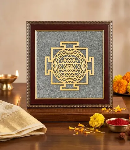
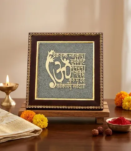
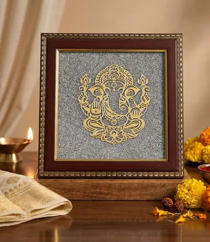
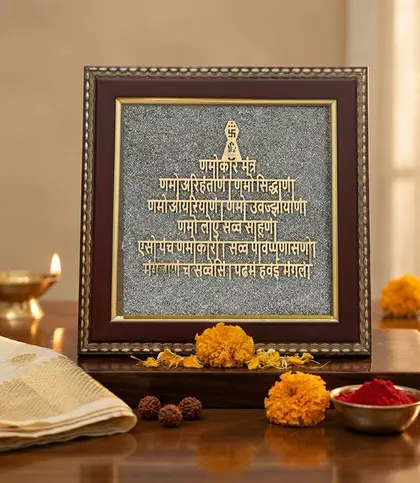
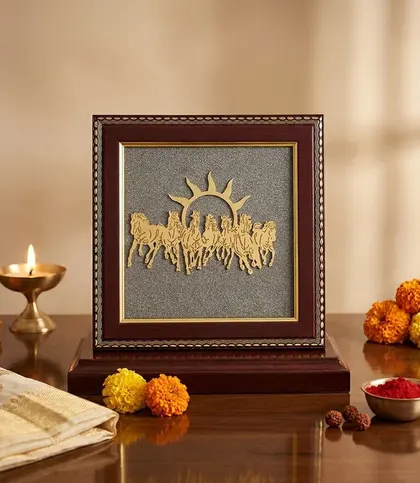
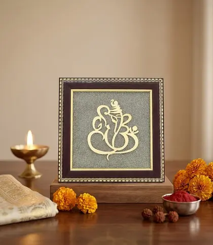
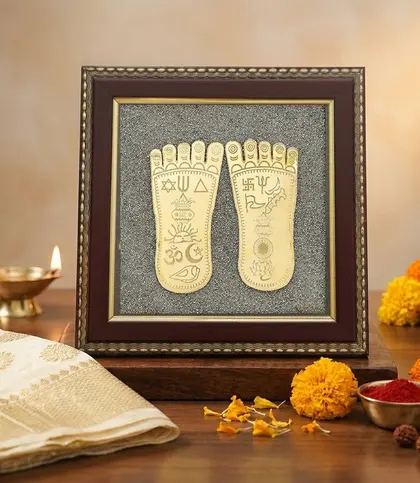
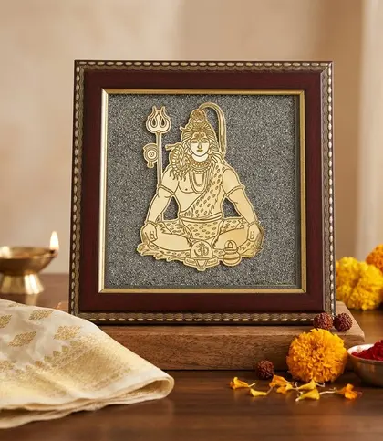
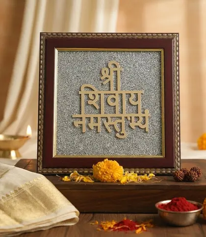
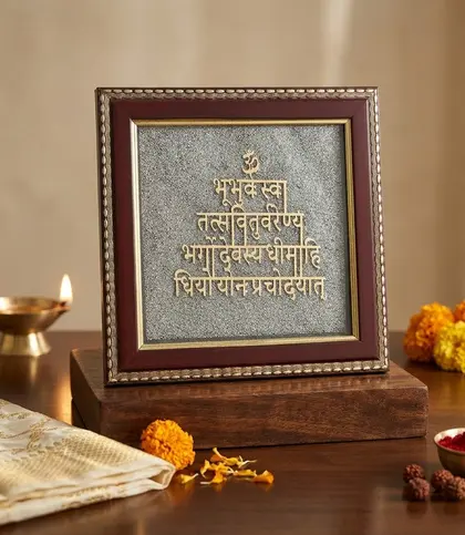
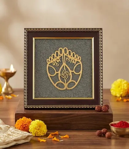
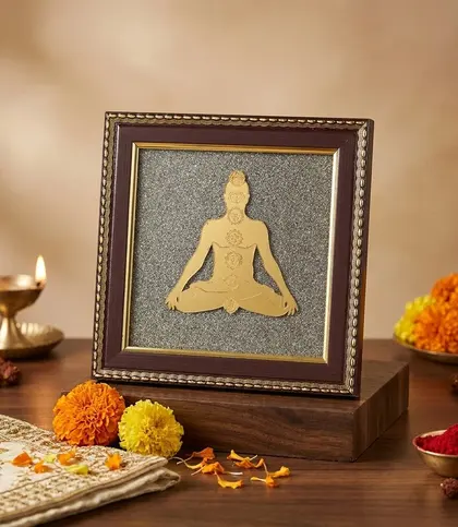
DIVINEHINDU Wall Art & Paintings bring Indian-inspired spiritual imagery into the home through compact, framed accents. Think gold-toned motifs and lettering against textured grey pyrite, with wood adding warmth around the edges. The effect is decorative without losing the significance of the symbol you choose. A piece can mark out a prayer corner, lend character to an entryway or bring a contemplative note to a living room wall.
This collection suits anyone who wants their wall decor to express something personal. Some designs centre on a deity or sacred symbol; others use a mantra or a meditative figure. Rather than choosing by colour alone, begin with the image or words you would be glad to see every day. Then consider how the frame, finish and scale will sit alongside the rest of your room. For more from the brand, explore the wider DIVINEHINDU collection.
The motif sets the tone, even when pieces share a similar palette. A figure-led design makes an immediate focal point, while lettering or geometry invites a closer look. These distinctions can help you narrow your choice:
Choose devotional imagery according to your own practice and preferences; there is no need to make every room follow a rigid placement rule. If you are looking beyond this brand for a different interpretation of the theme, browse spiritual wall art and paintings or explore Indian wall art and paintings.
Wood and pyrite work together here rather than acting as competing material options. The wood introduces a rich frame-like border, while the pyrite gives the centre a textured appearance. Gold-toned details stand out against grey, making the artwork noticeable even when the rest of the palette is restrained. Brown framing can help connect a piece to wooden furniture, warm flooring or other earthy accents.
Finish changes the mood. A glossy piece catches the light and can feel more ornate alongside brass-toned accessories or richly patterned textiles. A matte finish offers a quieter reading of the same warm gold, grey and brown palette. If your room already has several reflective surfaces, matte may give the eye a place to rest; if the surrounding wall is simple, gloss can add a touch of polish. Check the finish of the individual piece rather than assuming every design has the same sheen.
These are framed wall accents, not large canvases intended to fill an entire wall by themselves. Their square shape lends itself to a tidy arrangement, but check the listed dimensions before buying. A compact artwork might sit neatly above a console, beside a doorway or within a small grouping; on a broad, empty wall, it may need more visual company. If you want a different scale or medium, the broader wall art and paintings collection offers another starting point.
For a single piece, first decide whether you want it to be a focal point or a quieter accent. In a living room, try holding it against the wall at the height where you would naturally notice it from your usual seat. Above a sideboard or narrow console, leave some breathing room between the artwork and objects below so the motif remains visible. Near an entrance, choose a position that feels welcoming without putting the piece in the path of opening doors or everyday traffic.
A prayer or meditation corner calls for a slightly different approach: place the image where it can be seen comfortably and where its meaning feels appropriate to you. You can keep the surrounding wall simple, or coordinate it with a few considered objects. When grouping square pieces, lay out the arrangement on the floor first. Consistent gaps make related works feel intentional; mixing motifs can feel more personal when their frame colours and outer edges remain visually coordinated.
Lighting matters, too. Look at the wall at different times of day before settling on a position, particularly if you favour a glossy finish. Gentle ambient light can reveal the gold-toned details, while direct glare may make fine lettering harder to see. Keep delicate wall decor away from persistent dampness, and check the product details for its dimensions and mounting information before choosing a hanging point.
Before ordering, confirm three things on the product page: the motif, the listed size and the finish. Then picture the artwork on your actual wall, not just against a plain background. Will the gold details complement nearby accents? Does the frame work with your furniture? Is the image easy to appreciate from the distance at which you will usually view it? Those questions are more useful than trying to match every decorative item exactly.
For routine care, gently wipe the piece with a clean, dry cloth. Avoid treating the textured centre and decorative border like a washable print. Handle the frame carefully when repositioning it, and follow any item-specific care or mounting guidance supplied with your choice.
Choose a mantra when you have a position that allows the lettering to be viewed comfortably. A deity or meditative figure works well when you want the subject to register more readily from across the room. Above all, choose imagery that is meaningful to you.
It can, but consider the wall’s scale. A compact square accent may feel best above smaller furniture or as part of a carefully spaced grouping. Measure the available area and compare it with the dimensions of the piece you like.
Think about the surrounding light and textures. Glossy finishes add a polished, light-catching touch; matte finishes look more understated. Check the individual listing for its stated finish before making your choice.
Vaaree is a destination for curated, premium, pretty home products. It is a place to explore wall art with an eye for both personal meaning and how a piece will look in your home.