


Shiplap and Chandeliers: A Guide to Pairing Them Well
Quick Answer
Shiplap and chandeliers work well together when the chandelier adds a focal point without competing with the boards’ repeated lines and texture. Choose its silhouette, scale, finish, and contrast level according to whether the shiplap is on the walls or ceiling, the room’s style, and the furniture zone below it.
Definitions
Shiplap
A wall or ceiling treatment made from overlapping boards that creates repeated horizontal or vertical lines and a distinct textured backdrop.
Visual weight
How visually substantial an object feels based on its size, colour, material, shape, and density, regardless of its actual physical weight.
Chandelier silhouette
The overall outline and shape of a chandelier, such as clustered, linear, tiered, branched, or compact.
Contrast pairing
A deliberate combination in which the chandelier differs from the shiplap in colour, finish, material, or shape while still relating to the room.
Shiplap and Chandeliers: Start With the Room’s Needs
A chandelier can be an effective partner for shiplap: it can establish a focal point, bring a polished note to a textured backdrop, or give a large room a clearer visual centre. This can work especially well in dining rooms, entryways, living rooms, and bedrooms where the furniture arrangement benefits from a defined decorative element.
The pairing works best when one feature is allowed to lead. If the shiplap is dark, heavily textured, richly coloured, or spread across several surfaces, choose a chandelier with a simpler outline and fewer decorative layers. If the shiplap is restrained, pale, and clean-lined, the chandelier has more room to introduce shape, colour, or sparkle.
Decorative compatibility is separate from practical installation suitability. Focus first on whether the fixture improves the room’s composition, rather than treating a chandelier as an automatic addition to every shiplap surface.
- Use a chandelier when the room needs a defined focal point or a visual counterpoint to the boards.
- Choose a more edited fixture when the shiplap already delivers strong texture and pattern.
- Let the room’s furniture layout, not the wall treatment alone, guide the decision.
First Decide: Shiplap Walls or a Shiplap Ceiling?
With shiplap walls, a chandelier sits in the foreground and can introduce a contrasting finish or softer shape against the boards. It can make a broad expanse of panelling feel more purposeful, particularly when it is visually related to a table, seating area, or entry zone.
A shiplap ceiling calls for a more edited visual relationship. Consider the fixture’s central presence and how its outline reads against the board pattern. A lower-contrast chandelier can support a calm, cohesive look when the room already has substantial texture.
Horizontal boards benefit from rounded, clustered, or vertically layered chandelier details that interrupt the repeated lines. With vertical shiplap, a wider or more horizontally distributed form can counter the upward pull of the boards. If both walls and ceiling are clad in shiplap, keep the fixture’s form and finish especially restrained.
- Wall shiplap gives the chandelier a textured backdrop and a clear foreground role.
- Ceiling shiplap benefits from a chandelier with a distinct but uncluttered silhouette.
- Use a contrasting direction of line to create balance rather than repeating the boards exactly.
Match the Chandelier to the Shiplap Style
Rustic shiplap generally works well with iron, warmer-looking metal, or tactile fabric details. The aim is to reinforce the room’s relaxed character without adding so much ornament that wood texture, furnishings, and lighting all compete for attention.
For coastal shiplap, airy silhouettes, white tones, and glass details can preserve an open, breezy feel while still defining the room’s centre.
Farmhouse rooms often suit balanced designs with visible material character, such as restrained metal, soft ivory, or warm accents. Modern shiplap benefits from controlled geometry and streamlined metal forms. The Candela I Chandelier offers a quieter iron direction that can complement clean boards without overwhelming them.
Use contrast deliberately. A polished or crystal element can elevate an understated shiplap backdrop, while a simple metal or ivory fixture lets shiplap remain the main source of texture.
- Rustic: favour warmth, tactile detail, and modest ornament.
- Coastal: keep the silhouette light and the overall palette bright.
- Farmhouse: balance material character with restraint.
- Modern: prioritise clean geometry and fewer decorative layers.

₹6,799
₹20,182
66%OFF
Choose a Chandelier Size That Matches the Room
Judge chandelier size by the room as a whole, the furniture beneath it, and the visual density of the shiplap. A fixture that feels proportionate in an open, minimally detailed room may look overbearing once board texture, beams, artwork, and layered furnishings are added.
Small chandeliers are often better for compact entryways and bedrooms, or for rooms where shiplap is already a strong focal point. Medium-scale designs are versatile in many dining and living spaces, offering presence without overtaking the wall treatment. Larger silhouettes need enough room, ceiling presence, furniture footprint, and surrounding negative space to feel intentional.
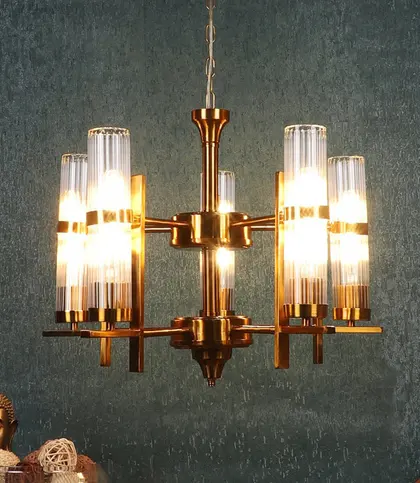
Visual weight is not just about dimensions. A dense clustered or crystal-led chandelier can appear larger than a streamlined metal fixture of a similar size. The Candile Iron and Glass Clustered Chandelier - Gold is a stronger focal-point direction, best considered where the room can accommodate a more substantial visual centre.
Try a simple visual test: step back and ask whether the chandelier is clearly visible, related to the furniture zone, and comfortably contained within the room’s overall composition.
- Smaller fixtures suit intimate rooms and visually busy shiplap settings.
- Medium visual weight is often the most flexible choice for everyday living and dining spaces.
- Large or dense designs need clear surrounding space to remain elegant rather than crowded.
₹10,649
₹35,900
70%OFF
Coordinate Finish and Material With Shiplap
White shiplap can support either harmony or contrast. Ivory and white fixtures create a soft, low-contrast scheme, while iron, gold, or warm metal can give pale boards a sharper focal point. Neither approach is inherently better; the surrounding furniture and accent colours determine which feels more cohesive.
Natural or warm-toned shiplap can sit comfortably alongside iron, warm metal, glass, fabric, and selected wood or rattan accents. The key is editing: avoid accumulating too many competing textures in one sightline. Metal adds definition and structure, fabric softens a fixture’s presence, and glass or crystal brings a more reflective, refined look.
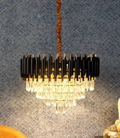
For dark shiplap, lighter or reflective details can help the chandelier remain visually distinct. The Auristra III Crystal Chandelier offers a polished crystal-and-iron direction for a room that calls for contrast and a more elevated focal point. With pale shiplap, darker metal can perform the same visual role.
Matching the chandelier exactly to the shiplap is optional. Instead, repeat a finish elsewhere in the room through furniture hardware or an accent object, or use related undertones to make a contrasting choice feel deliberate. A warm accent can bring a considered note of colour to a rustic or farmhouse palette.
- Glass and crystal create a brighter, more refined visual effect.
- Metal brings structure and definition against soft or pale boards.
- Fabric can soften the chandelier’s outline.
- Repeat a related finish elsewhere to make contrast feel connected.
₹4,640
₹13,250
65%OFF
Create Visual Balance Around the Shiplap
Centre the chandelier conceptually over the room’s principal furniture or focal zone rather than using the shiplap wall as the only reference point. In a dining room, relate it to the table; in a living room, to the seating arrangement. In a bedroom or entryway, let the available visual breathing room guide the composition.
Vertical shiplap creates an upward rhythm. A rounded cluster or chandelier with horizontal spread can soften that pull. Horizontal shiplap creates a broad, linear rhythm, so vertical drop, tiers, or clustered depth can add dimension rather than simply echoing the wall.
With a shiplap ceiling, choose a silhouette that remains distinct from the board pattern. Surrounding negative space matters too: beams, mirrors, large artwork, and heavily styled furniture can all reduce the visual clarity of a chandelier. Edit nearby elements if the fixture is meant to be a focal point.
- Anchor the chandelier to a furniture zone, not just a ceiling centre point.
- Counter the board direction with a complementary chandelier silhouette.
- Leave enough uncluttered space for the chandelier’s outline to read clearly.
Common Shiplap and Chandelier Pairing Mistakes
The most common issue is stacking too many statement elements together: ornate lighting, textured shiplap, exposed beams, large artwork, and layered furnishings can quickly make a room feel visually overloaded. When the backdrop is busy, simplify the fixture or reduce contrast.
Another frequent mistake is going too small. A tiny chandelier can disappear against a broad wall of high-contrast shiplap, leaving the room without the focal point it was meant to create. The reverse is also true: a large, elaborate chandelier can overwhelm a compact room simply because there is a ceiling or wall feature to respond to.
Avoid repeating the direction of the boards too literally. Also resist treating white shiplap as a rule that requires a white chandelier. Style labels are useful starting points, but silhouette, material, colour, furnishings, and negative space should be considered together.
- Do not layer multiple competing statement features without a unifying palette.
- Do not choose a fixture so small that it fails to register against the shiplap.
- Do not assume matching colours are the only path to a cohesive room.
- Do not ignore the furniture zone the chandelier is intended to anchor.
A Quick Pairing Checklist
Before choosing a chandelier direction, use the room itself as the filter. This keeps the decision rooted in composition rather than a single style label or finish preference.
- Is the shiplap on the wall, the ceiling, or both?
- Do the boards run horizontally or vertically?
- Is the overall room rustic, coastal, farmhouse, or modern?
- Should the chandelier blend with the shiplap or provide contrast?
- Does its visual weight suit the room and the furniture beneath it?
- Will its material add useful variation without causing texture overload?
- Is the surrounding decor edited enough for the chandelier to remain a focal point?
Chandelier Directions to Explore
When browsing chandeliers for a shiplap room, start with a visual direction rather than a rigid product rule. Clustered iron-and-glass forms create a stronger focal point in rooms with enough open space. Streamlined iron silhouettes are a more restrained route for modern or farmhouse shiplap, while crystal introduces a brighter, more polished counterpoint.
Ivory and white choices support lower-contrast farmhouse or coastal schemes. Warm metal-and-fabric details can be useful where rustic or farmhouse shiplap needs colour and softness. Test every direction against the room’s board orientation, furniture footprint, existing finishes, and amount of visual texture; these are styling examples, not universal room-specific solutions.
- Choose clustered forms when the room needs a more expressive centrepiece.
- Choose streamlined metal when clean lines and visual restraint matter most.
- Choose crystal when a refined contrast suits an otherwise understated backdrop.
- Choose ivory or white for an airy, lower-contrast approach.
- Choose warm colour and fabric only when the wider palette can support them.
Final Verdict: Pair by Contrast, Scale, and Restraint
A chandelier suits a shiplap room when it adds needed focus and has visual weight proportionate to the space. The most reliable approach balances one strong feature with one edited feature: choose a clean, lower-contrast chandelier for richly textured or extensive shiplap, or allow more shape, sparkle, or colour when the boards are restrained. Use board orientation, finish, and material to create balance rather than matching every detail; if the room feels visually full, reduce the fixture’s scale, ornament, or contrast.
- Prioritise proportion and visual breathing room over a strict style formula.
Final Verdict
- Choose a chandelier that gives the room a useful focal point while leaving shiplap’s texture and lines visually legible.
FAQs
Which chandelier styles work best with shiplap walls?
The best style depends on the room’s overall character. Streamlined metal works well with modern shiplap, warm iron or fabric details suit rustic and farmhouse settings, and white, glass, or airy silhouettes can complement coastal shiplap. Choose a simpler design when the walls are already heavily textured or richly coloured.
Can you use a chandelier with a shiplap ceiling?
Yes, from a design perspective, provided the chandelier has a clear silhouette against the board pattern and does not make the ceiling feel overly busy. A cleaner form is often easier to read against ceiling shiplap, especially when the walls also have prominent texture.
How do you choose a chandelier size for a shiplap room?
Consider the room’s overall scale, the furniture zone below the chandelier, and the visual density of the shiplap. A dense clustered fixture can feel more substantial than a streamlined design of similar dimensions, so assess visual weight as well as apparent size.
Should chandelier and shiplap colours match?
No. A matched white or ivory pairing can look calm and cohesive, but deliberate contrast can be equally effective. Dark metal, gold, glass, or crystal can create a focal point against pale shiplap; repeat a related finish elsewhere in the room to make the contrast feel connected.
What chandelier finish complements white shiplap?
White shiplap is flexible. Ivory and white finishes offer low contrast, iron creates graphic definition, warm metal adds warmth, and glass or crystal introduces a more polished visual note. Choose according to the room’s furniture, palette, and desired level of contrast.
How should a chandelier be positioned with vertical shiplap?
Visually relate the chandelier to the room’s main furniture zone, then use its shape to counter the boards’ upward rhythm. Rounded clusters or forms with horizontal spread can create balance, while leaving enough open space around the fixture helps its silhouette stand out.
What are common mistakes when pairing shiplap and chandeliers?
Common mistakes include choosing a fixture that is too ornate for a busy room, selecting one too small to register against the boards, repeating the shiplap direction too literally, mixing unrelated finishes, and ignoring the furniture area the chandelier should visually anchor.